Neiman Marcus Checkout Redesign
The Neiman Marcus e-commerce checkout platform is underdelivering for both the customer and the business. The platform is cumbersome to develop on and inflexible to enhance, and the customer experience is outdated and unintuitive, and leads to a leaky conversion funnel. To coincide with a technical migration to another platform, my team reimagined the user experience to improve usability while modernizing the look and feel.
Design Tenets
The team adopted Simple, Clear, and Fast and Functional AND Beautiful as our guiding design principles, which helped us stay true to our intended UX vision. Examples of these include:
Simple: Use of progressive disclosure to give access to, but not display by default, secondary features, so that the majority of users only see what's necessary to support their flow (e.g., gift options, gift cards)
Clear: Modal states to preserve context when performing tasks through secondary flows
Fast: Use of address auto-complete to speed form completion
Functional AND Beautiful: Introducing a serif font to better convey the brand trait of elevated luxury
Inputs
The team incorporated several sources of input in order to inform the design, including:
Funnel conversion data
Feature usage, error rates
User research
E-commerce research (e.g., Baymard Institute studies)
Competitive analysis
Trend research
Framework
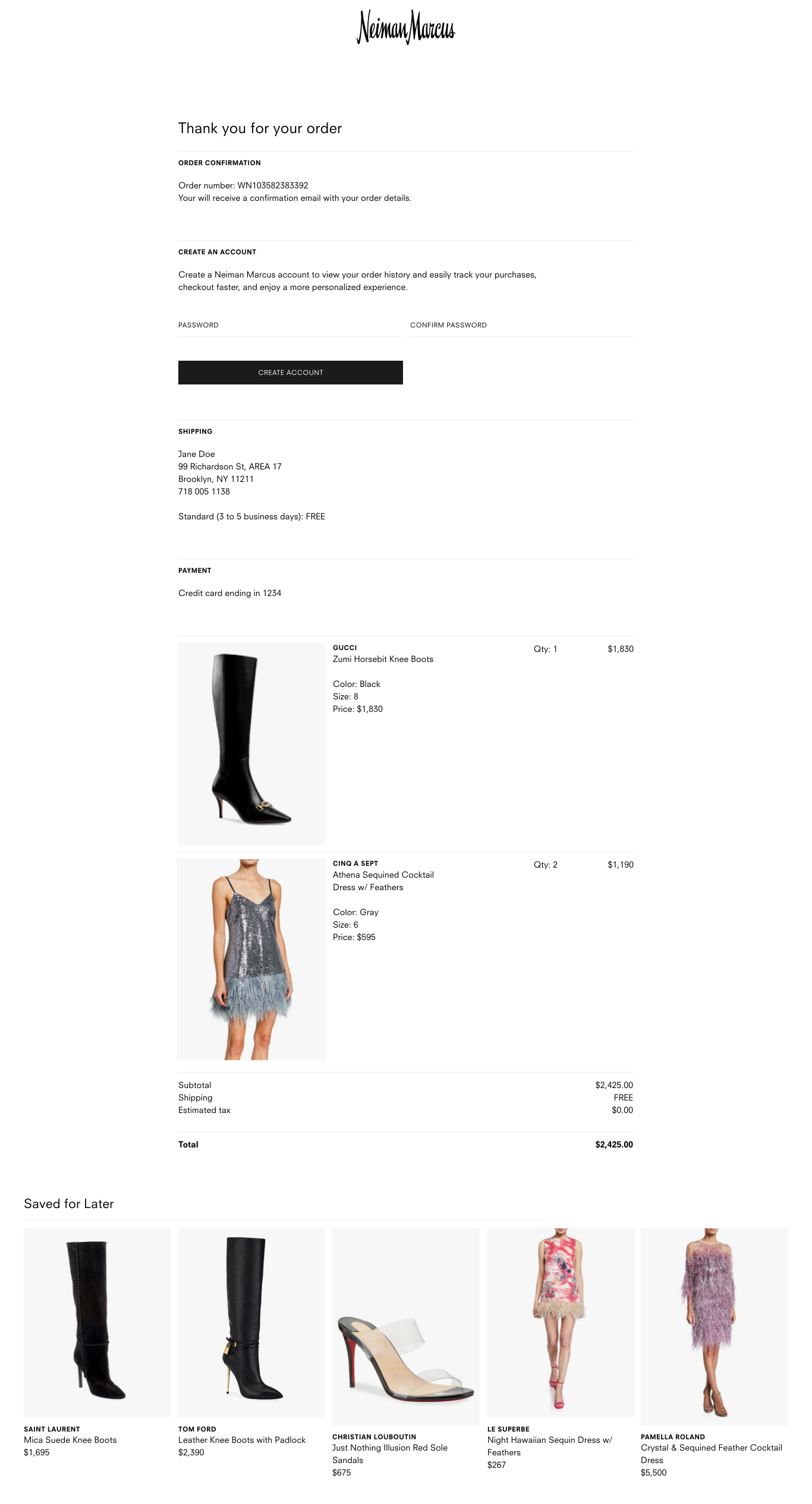
The team identified different checkout “models” and weighed the relative pros and cons of each before deciding on the “page-to-page” model represented by the design comps. The models considered were single-page, accordion, and page-to-page. Here’s an example of high-fidelity wireframes showing an earlier version of the page-to-page model.
Design System Thinking
We always kept in mind consistency and reusability when crafting the design solutions. Some examples include:
Revamped the entire forms UI system (fields, menus, buttons, labeling, etc.)
Introduced a panel UI that the user would become accustomed to interacting with when performing certain tasks. The plan is to reuse this design pattern not just within checkout but throughout the rest of the shopping experience.


